Essential Manufacturing Charts for Production Tracking
by Saravana Kumar

With the advent of Industry 4.0 and Industrial Internet of things, manufacturing charts created today are able to take a closure look at the data that has been in silos for a long time. The IIoT has made it possible to get the data into the analysis engine within seconds. The digital transformation, the powerful software, connectivity, and the upcoming AI will create a larger impact on the data manufacturers have been looking at for decades. Manufacturing execution systems are getting more and more affordable for the MSMEs and the enterprises equally based on their needs and size. Even though the possibilities to visualize the IoT Data is humongous, here are the top lists of production charts that can help track the output at the shop floor level to keep the operations up and running.
Manufacturing Utilization Charts
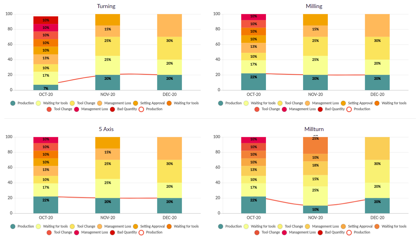
The utilization chart is a key tool for representing manufacturing or production efficiency. It illustrates how effectively a facility's production capacity is being leveraged, showcasing the percentage of available production time during which machines were actively processing goods. Manufacturing chart also provides the key machine offline details with the reason for each incident. This chart provides insights into the level of operational output achieved, visually covering aspects like machinery capacity and available resource use. Operators can analyze utilization from multiple perspectives, allowing for a thorough understanding of how production assets are employed.
A utilization graph is especially helpful for identifying bottlenecks in productivity. By pinpointing these issues visually, teams can address inefficiencies more effectively. The machine utilization chart offers a snapshot of your operation’s efficiency by integrating factors tracked within your Smart Manufacturing execution system, enabling production managers to gain valuable, data-driven insights. With this clear view, managers can assess machine performance, optimize throughput, and make informed decisions that drive productivity improvements at every level of manufacturing.
Plan vs Actual
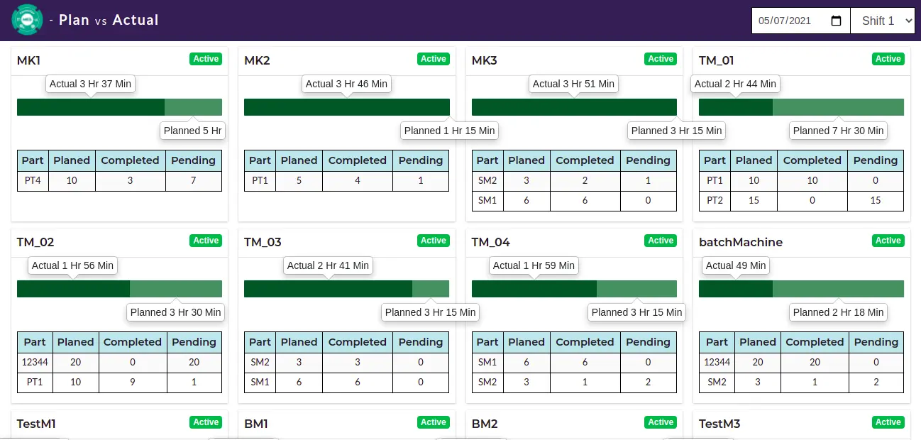
The Manufacturing Utilization Chart is vital for understanding resource use, but the Plan vs Actual Chart offers a deeper, part-by-part view of production. Unlike a simple production target, effective production management is about control and adjustment. Analyzing Plan vs. Actual performance provides insights that help improve manufacturing operations productivity by allowing real-time monitoring, process review, and adjustments based on actual outcomes.
This chart compares your planned production targets with the actual output, highlighting discrepancies and offering a direct lens into production efficiency. While the production plan lays out essential targets and execution details, tracking the actual process is essential for identifying deviations and understanding what occurred on the production line. Using a Smart Factory Solution, manufacturers can leverage this data to manage production with increased precision and oversight.
The Plan vs. Actual Chart enables managers to compare expected and actual production rates for each shift, machine, and completed operation. This tool helps identify production overruns, pinpoint areas for process improvement, and support rescheduling efforts when the production plan doesn’t match customer demand. On the shop floor, where various factors affect production continuity, the Plan vs. Actual Chart enables tracking at the machine level, facilitating targeted interventions to align production with business objectives.
Machine Production Charts
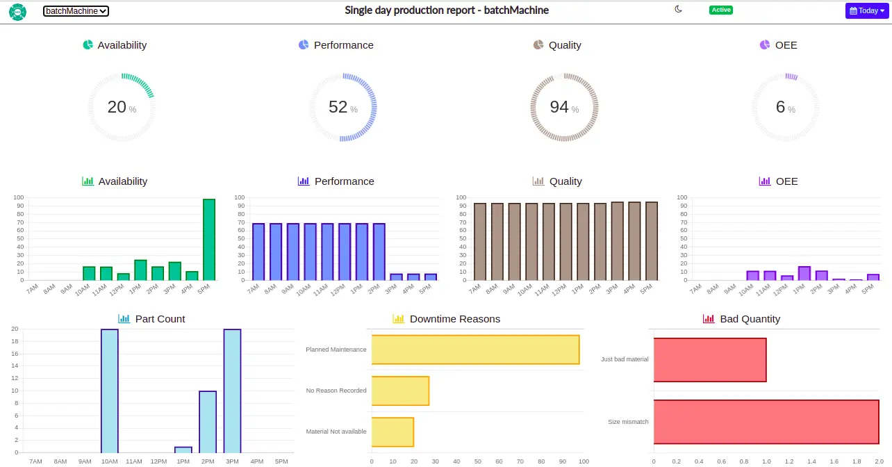
From Production planning to execution, production managers and shop floor supervisors rely on a comprehensive machine reporting interface within MES software for effective performance control and analysis. With access to detailed insights, they can make quick, informed decisions regarding machine operation, quality, or performance issues. The interface enables highly visual displays of KPIs, including OEE, machine downtime reasons, and defect quantities, empowering users to track performance metrics at a glance.
The Machine Drill Down Report allows users to delve into individual machine performance within specific departments or units, covering periods as granular as a single day or spanning a customized date range. Rather than providing a broad overview, this report delivers machine-specific insights, helping managers identify performance trends and efficiency gaps at a deeper level. With this detailed analysis, production managers can make decisive, targeted improvements, boosting overall production line performance and efficiency.
Manufacturing Department Charts
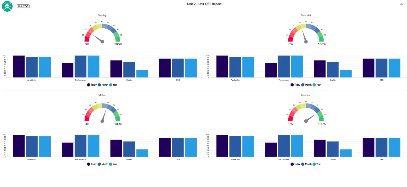
Departmental manufacturing charts offer a comprehensive view of performance by consolidating all machine information within a single dashboard. These reports highlight essential KPIs, including the core metric Overall Equipment Effectiveness (OEE), Availability, Performance, and Quality metrics for all machine operations within a department. Additionally, the dashboard displays production data and machine utilization rates, enabling supervisors to quickly assess the department's overall performance. Updated every hour, this dashboard ensures that any necessary corrective actions can be taken promptly.
For the management team, these charts provide insights into each department's performance, aiding in high-level process optimization. Manufacturing setups often structure shop floors such that each department oversees a specific stage of production for various parts. By tracking and analyzing these departmental charts, companies can streamline specific processes, enhance efficiency, and improve overall output, helping achieve continuous improvement in production quality and Manufacturing productivity.
Manufacturing OEE Trend Chart
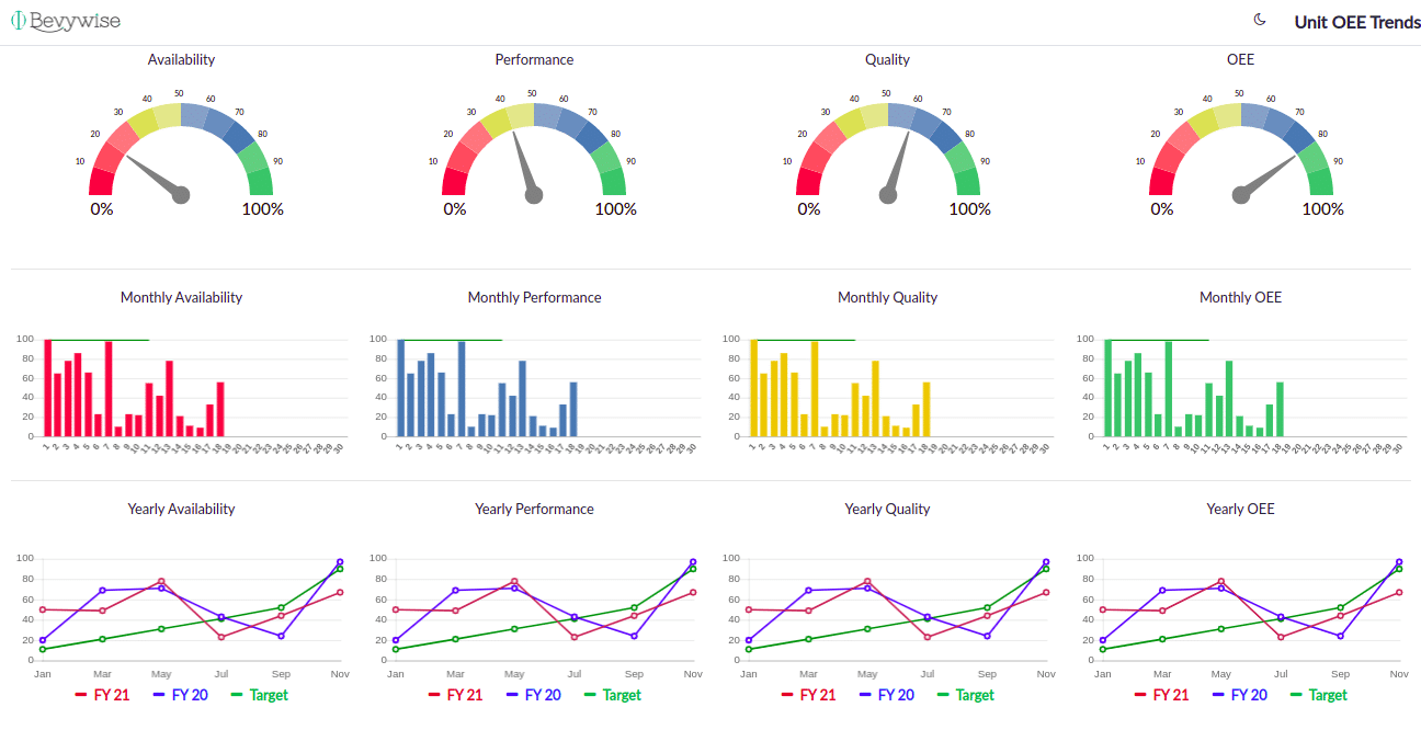
For any business aiming for improvement, tracking performance over time is essential. Department trend charts provide a clear view of OEE, Availability, Performance, and Quality metrics, displaying trends over the last 30 days and 12 months to validate overall performance.
Trends not only highlight progress but also inspire setting new, higher targets. The OEE trend chart, widely used in manufacturing, visually represents OEE data over time. This long-term view allows a deeper understanding of production process performance, particularly in relation to set goals. By examining OEE trends, it becomes easier to identify areas for improvement and to explore how Availability, Performance, and Quality interrelate. Production managers can use these monthly and yearly OEE trends to optimize operations, assess goal progress, and make adjustments where necessary. This approach also supports the continual raising of performance standards, encouraging incremental progress toward sustained improvement.
It is crucial to understand the OEE Calculation methods and formula for your manufacturing process before implementing these trends and the OEE Charts.
Bevywise Smart Factory Solution has been deployed for Enterprise from planning till delivery to track not only production, but also process parameters & SPC Charts, WIP Tracking Charts, Traceability and correlation views, Quality Trends and more. Todays connected technologies help us generate a large amount of data and it is crucial to ensure that we view the data with the right perspective to make the right decisions.
Looking to enhance Shop floor Production
Deploy the Right MES Solution
Data Collection, storage, Data Analysis, visualization, Decision making
All in One Product
