Manufacturing Reports : Why are interactive visuals important?
by Saravana Kumar
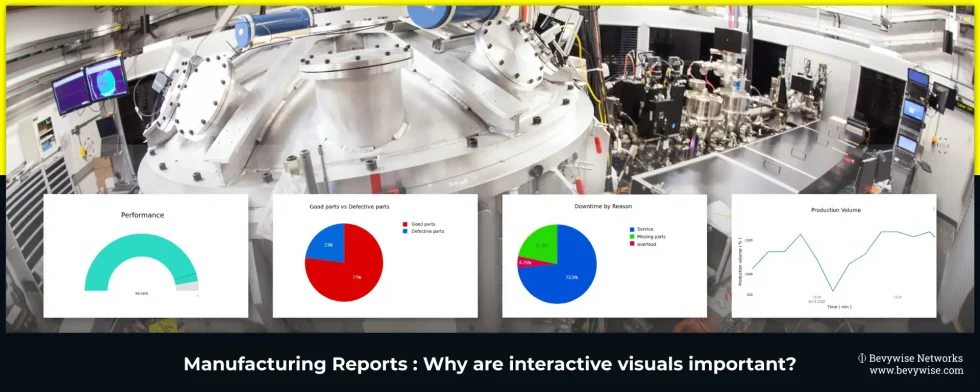
Data is everywhere in the modern-day world. Collection of data has become easier because of the increasing number of platforms to record it. However, gaining necessary insights and creating business decisions off of data which are exhibited in tables/spreadsheets is obsolete, out of date and inexpedient. Ergo, countless businesses use graphs & charts in reporting to visualize their data in distinct ways, which allow decision-makers to discern trends and patterns more rapidly and intelligibly than through simple spreadsheets. Visualizing data can benefit wide areas of business/industry, and also, the manufacturing industry is one such essential area which can’t function effectively excluding data visualization implemented manufacturing reports. Well!! Last week, in our blog post, we have explained how to transform boring reports? & how to choose the right report? Just in case you overlooked, you should obviously take a look. Now as a series of previous blogs, this one will provide a detailed explanation on which type of data visualization, manufacturers need, to get their reporting right.
Why production reporting needs visualization?
Production managers need to answer many questions. Some of them include,
- What is the efficiency of your production?
- What was the reason behind the production capacity lagging?
- How efficient is your machinery?
Answering these questions will not be easy unless production managers earn actionable insights from the production data. But the series of numbers in rows & column will not provide a proper answer. Of course the numbers are important. But gaining important attributes from the data is much important which we cannot expect from the boring & dry manufacturing reports in the form of tables & spreadsheets. This is because industries are generating millions of data per day and they will log these data either in notepad or in log sheets. At the end of the day, the data collected will simply remain as numbers & no insights can be gained from it. This is where every manufacturing industry needs data visualization in their reporting.
Manufacturing reports with data visualization implemented, allow managers to track important metrics and KPIs that align with business objectives and help them assess how far or close they are to their target. This will help them uncover actionable insights that help the business grow and actually stay in business.
Choosing the right form for reporting
Manufacturing depends on an increasing number of factors such as manufacturing efficiency, machine effectiveness, capacity, production planning , availability, and quality etc. The above mentioned factors should function as a whole for a better running of manufacturing industry. Fortunately, visual manufacturing reports furnish a feasible solution to keep an eye on not only each of these factors but also how their tie-up influences others.
But, the thing is, not all areas can be created equal in manufacturing. There are many different types, and they all have different processes & KPIs. Hence each process demands a different type of manufacturing reports. Here are the few areas & KPIs where different types of graphs / charts are used.
Production Downtime Reporting
Downtime is most often associated with equipment failures or breakdown. It probably comprise of any unplanned event that causes manufacturing process to stop. Tracking downtime is important for the manufacturing industry and the overall productivity depends on equipment performance. Hence it is necessary to understand the causes & impact of downtime.
Coming back to the use of charts, let us see, which types of charts much suits to visualize downtime report.
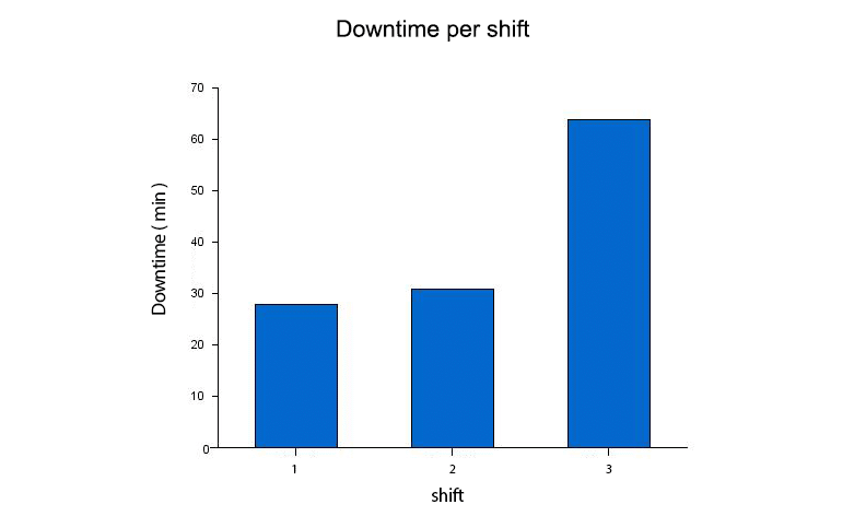
Downtime per shift
Identifying & tracking downtime in each shift is necessary to solve the defects & attain efficiency. Use of Bar chart much suits this as bar charts can display changes over time helping people to visualize trends. In terms of downtime reporting, bar charts can display occurrence of downtime for each shift.
And also, to compare downtime for each shift for each month in a single graph, Grouped or Clustered Bar chart can be used.
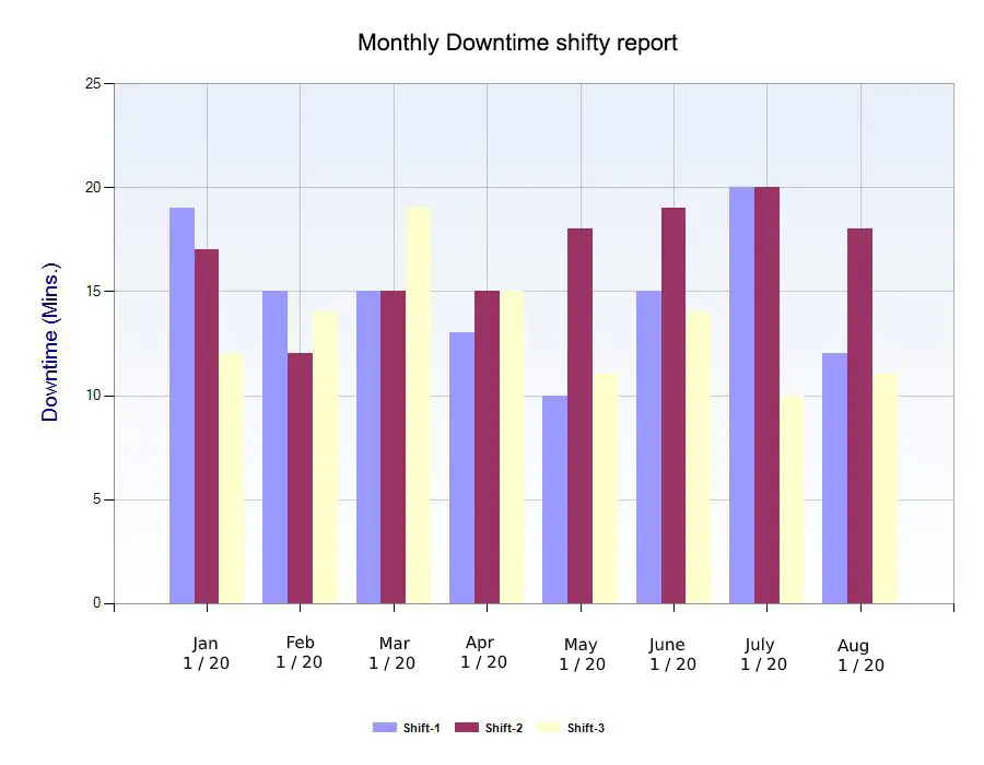
By the way, these charts can also be used to view downtime per machine/equipment.
Runtime vs Downtime
Runtime refers to the time in which the machine keeps running for without any repair or shutdown.

Downtime by reason
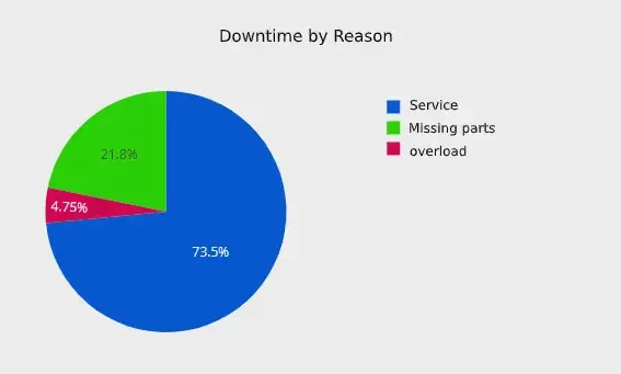
All downtime will not come under unplanned event. Downtime can also be planned. So identifying & comparing the reason for downtime is as important as understanding the cost of downtime. This provides an actionable insight not only to optimize the downtime but also keeping it under control by maintaining machinery.
As mentioned earlier, the reasons for downtime should be compared to optimize it, and this can be done using PIE Chart. No other charts can perfectly visualize the comparison of data like PIE chart.
Quality reporting
In order to maintain low production costs and high profitability, it is vital to oversee & handle the scrap rate. Scrap rates compute the ineffective/malfunctioned assemblies or production of an output product which cannot be restored/repaired and as a consequence, it is thrown away or abandoned. Below standard raw materials which is serving as a deterrent, incautious framework strategy, out of order machines or ineffective production operators are the main reasons for scrapping.
Keeping an eye on excessive scrap rates of specific machinery or production group, production managers can do their best to detect the root causes for it and catch the necessary measures to avoid or prevent scrapping.
In terms of reporting quality, Stacked Area chart & stacked bar chart are suitable.
Stacked Area chart can be plotted for scrap rate by each product category/equipment. The same can be done using Stacked bar chart that is each stack in a bar represents each product and bar can be plotted against time.
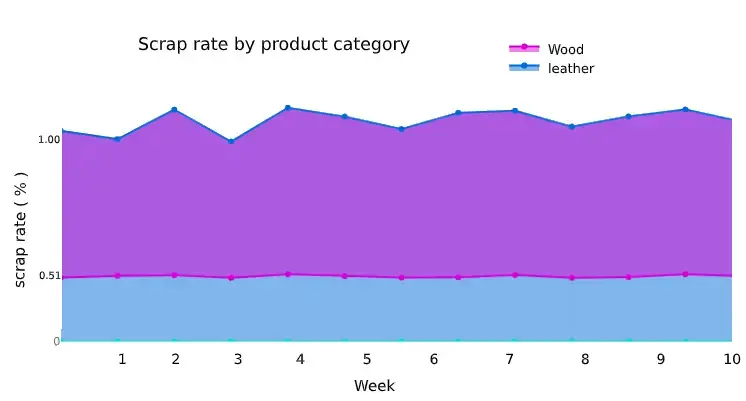
This helps in identifying the equipment / product which produces high amount of scrap rate. So that, quality manager can take necessary action to avoid the defects.
A production manager can identify the product category with the highest scrap rate and start analysing further from here.
Good Parts Yield
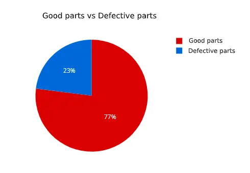
If production managers are intended to compare the good parts & defective parts produced, it is better to use Pie chart which will clearly picturize the part-to-whole relationship between both.
And also, to compare the good parts yield in shift wise, they can choose stacked bar chart.
Performance Reporting
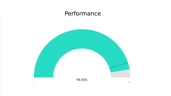
Assessing the factors which cause production to run below the optimal speed is much important that is understanding the performance of industry or production line. Performance KPI takes into account of issues such as machinery malfunctions and unplanned shutdown which causes huge impact on industry’s production line.
To map & visualize performance, Clustered Bar chart & gauge chart will be the suitable one. While clustered chart compares planned quantity & actual quantity produced in each shift / produced by each machines, gauge chart displays overall performance as percentage. This helps manufacturers understand, track & analyse the overall performance of machinery in each shift & performance loss.
Productivity Reporting
OEE is a global metric in terms of measuring efficiency & overall productivity. Enterprises should use modern visualizations to present OEE data in a way to assist the executives to come up with actionable insights. This highlights the Overall Equipment Effectiveness (OEE) and its associated KPIs that identifies the percentage of productive manufacturing time for an organization operating in multiple shifts
OEE by Machine
Bar Graph can be used to display the Overall Equipment Effectiveness (OEE) for the selected machines over longer time periods
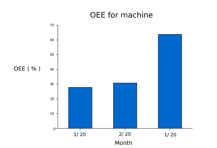
And also, Bar chart can be used to track Availability, Performance & Quality.
Production by Shift
Stacked bar chart can be used to map & compare production by each shift over time.
Production Volume Reporting
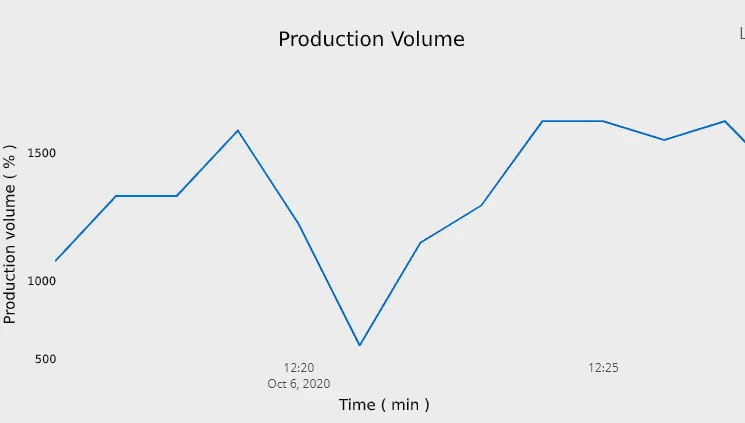
A good production volume is one that satisfies demand but does not leave too much inventory in stocks. It is an overview of what Industries are able to produce in a month, a year or a specific time period. By comparing production volume data with the previous time period, it will be easy for production managers to track & stop anomalies & progress.
To visualize which machine makes up for which percentage of production, Line chart will be the suitable one. This is because, it can perfectly picturize the performance & importance of each machine by spotting the trend.
Capacity Utilization Reporting
Capacity utilization measures how much of the industry’s available capacity they are actually using on production line. The thing is, they should boost the capacity utilization with an intent to make machines work at an ideal cycle time. So that, they can decide whether to scale production or identify any defects in the process.
Capacity utilization can be perfectly plotted using Line chart. This helps them know the capacity utilized by each machinery over time.
Hope this article provides you a idea on perfect implementation of data visualization manufacturing reports in Industry.
Hence, each type of visualization carries a specific role in Business / Industrial reporting and analysis. To make the reporting more simple we have added a support of incorporating data visualization types into reports in Bevywise IoT Platform.
Try to sign up with our IoT Platform at our free trial set up & get utilized with the new form of reporting.
To know the complete functionality of the IoT Platform, request a complete demo now.
